Styling the game with CSS
The Vorple interpreter is a web application so it can be styled to our liking using CSS. The general topic itself is too broad to go through here, but there are many books and Internet tutorials available, for example at the MDN.
Here's an example of a CSS rule that applies to an element with the id "output".
#output {
    background-color: #ffffff;
    color: #000000;
    font-family: "Roboto", sans-serif;
    font-size: 17px;
    line-height: 1.5em;
}
This gives the element
- White background (#ffffff)
- Black text (#000000)
- Font called "Roboto", or if it's not available, the browser's default sans-serif font
- Font size of 17 pixels
- Line height of 1.5 times the font size
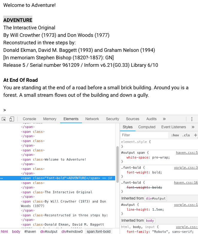
The easiest way to find what CSS rules to write is to run a Vorple game, find the element we want to style, right click on it, and select "Inspect element" from the context menu. The screenshot below shows Chrome's element inspector but it looks about the same in all browsers.

In the lower left panel we see the current HTML structure of the page with the element we right-clicked highlighted. On the lower right panel are the CSS rules that currently apply to it. The element has a class called "font-bold" so if we wanted to have all bold text to also have yellow background color we'd write:
.font-bold {
    background-color: yellow;
}
The dot . before the name in CSS signifies a class name.
Including stylesheets in an Inform project
To apply our CSS rules, we'd write them into a .css text file and include it along with the Vorple interpreter. It's advisable to use separate CSS files instead of editing Vorple's CSS files directly so that updating Vorple later is easier, as we then won't need to worry about overwriting previous changes.
Inform 6
Place the CSS file into the project directory and add an link to it into the play.html file:
<link rel="stylesheet" type="text/css" href="myCustomStyles.css">
Place custom stylesheets right under the line that loads the Vorple stylesheet (the line that looks otherwise the same but points to "interpreter/vorple.css".)
Inform 7
CSS stylesheets can be included in an Inform 7 project by placing the files to the Materials folder and using the release instruction "Release along with the style sheet":
Release along with the style sheet "myCustomStyles.css".
This includes the file in the release package and loads it automatically in the interpreter.
Styling elements created in Inform
When creating HTML elements in Inform, we can optionally give them a name (the first parameter in Inform 6 and "called" in Inform 7). This name corresponds to the class name of the HTML element that's created.
For example, after creating an inline element with
VorplePlaceInlineElement("greeting", "Hello!") (Inform 6) or
place an inline element called "greeting" reading "Hello!" (Inform 7)
the following HTML is generated:
<span class="greeting">Hello!</span>
If we wanted to print that text in bold font and dark red color, we could add this CSS:
.greeting {
    font-weight: bold;
    color: #661111;
}
(#661111 is the RGB hex color code for a dark shade of red.)
Responsive design
Responsive design means, in a nutshell, designing a web page or a web app so that it automatically adapts to different screen sizes, so that the same page looks good both in small smartphone screens and large desktop screens. A key technology to accomplish this is media queries which can enable and disable CSS rules depending on the screen properties.
Again, this topic is too broad to comprehensively go through here, but the
basic idea is to wrap CSS rules into @media directives that determine when
to apply those rules. Here we'll make Vorple's font size smaller when the
screen is very small:
@media (max-width: 480px) {
    html, body, input {
        font-size: 12px;
    }
}
There are two helper classes in the Vorple CSS files, sm-only and lg-only,
which hide elements when the screen width is smaller or larger than 568 pixels.
sm-only hides the element when the screen width is 569 pixels or wider,
lg-only does that when the screen is 568 pixels or narrower. These classes
are used in the Status Line extension to swap between the mobile status line
and the full status line.